When Jane Chuck, the highly influential founder of beauty and lifestyle brands Chuck's and Motherchucker's, first experienced the work of Jun Ong of POW, it was at the 2015 light installation 'Star' in Penang, a huge LED sculpture inspired by nature and outer space. Formed using long tubes of light that appeared to have crash landed into the shell of a raw concrete building, the vast illuminaton could be seen for kilometres. Fast forward to 2021 and Ong would be called on to help shape another star, this time the entrepreneur and social media force Jane Chuck and her new HQ coined the 'MotherQuarters.' Here, More Space catches up with two of the busiest creatives in the business to discuss the design DNA behind the transformation of the former APW printing factory, the pair's favourite furniture pieces, and how colour and detail create the soul of Jane Chuck's new HQ.
Hi Jane and Jun, great to chat with you both for More Space. Jane, can I ask what first drew you to Jun's work, and did you already know of one another?
Jane Chuck: Jun had this really big installation in Penang that caught my attention and we then did an event together called ‘Chuck’smas' back in 2021 which was my brand’s very first physical pop-up as we had only been selling online until then.
What was your brief to Jun, and how did the design process take shape?
Jane Chuck: I find Jun's work really inspiring and I wanted something that aligned with Chuck's and Motherchucker's brand image: something fun yet grounded at the same time. I wanted something nostalgic but keeping the brand identity. I gave him the freedom to propose his ideas.
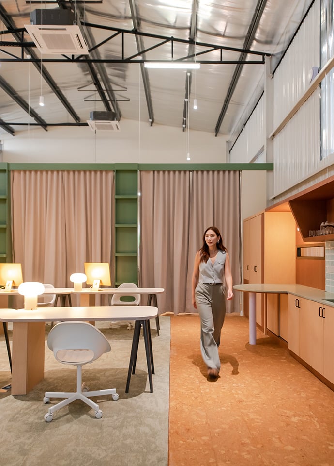
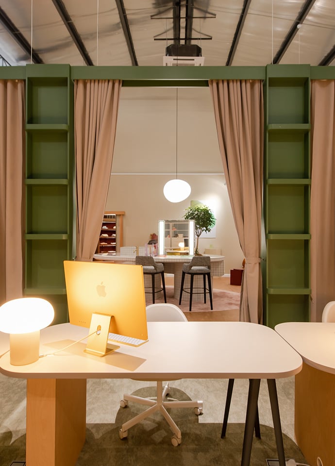
Jun Ong: It started during the lockdown, so most of the early conceptual design was done online. The entire design process took about two months. Although the brief from Jane called for an office and warehouse, we wanted to also push for the space to have a fully fledged showroom considering the footfall at APW.
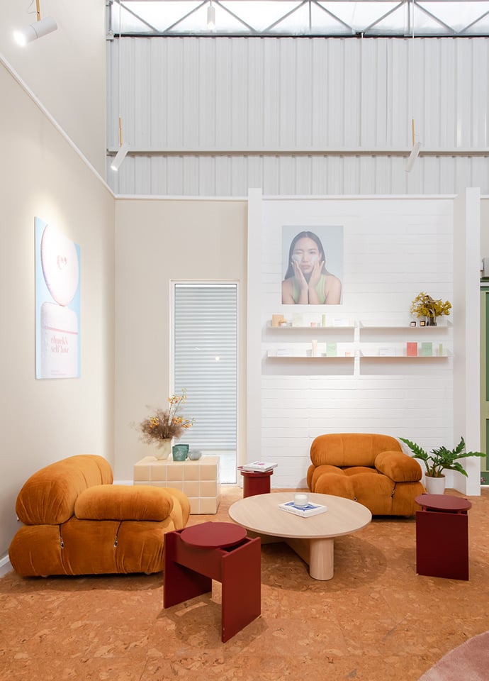
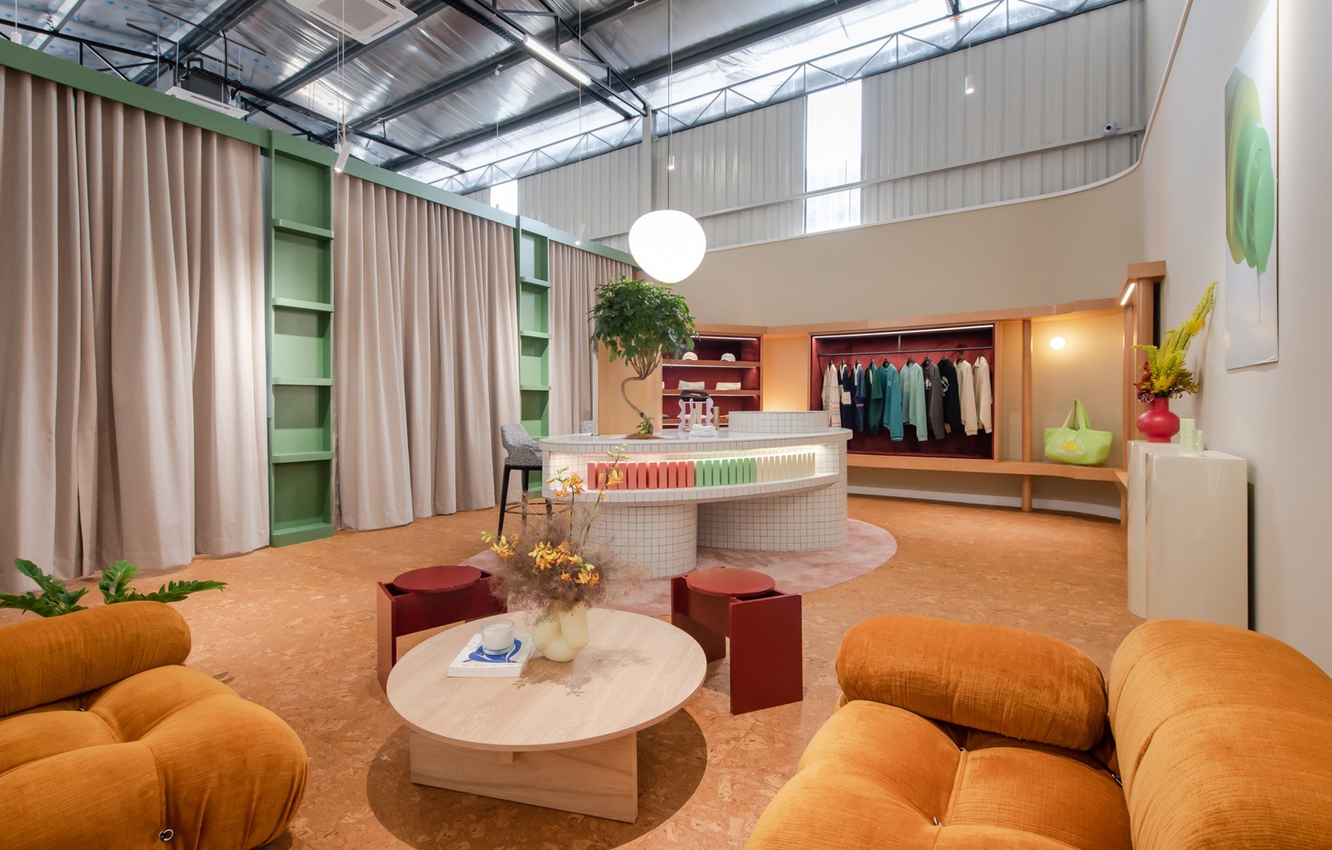
The iconic Camaleonda sofa first designed by Mario Bellini in 1970 for B&B Italia. Photo c/o Jane Chuck.
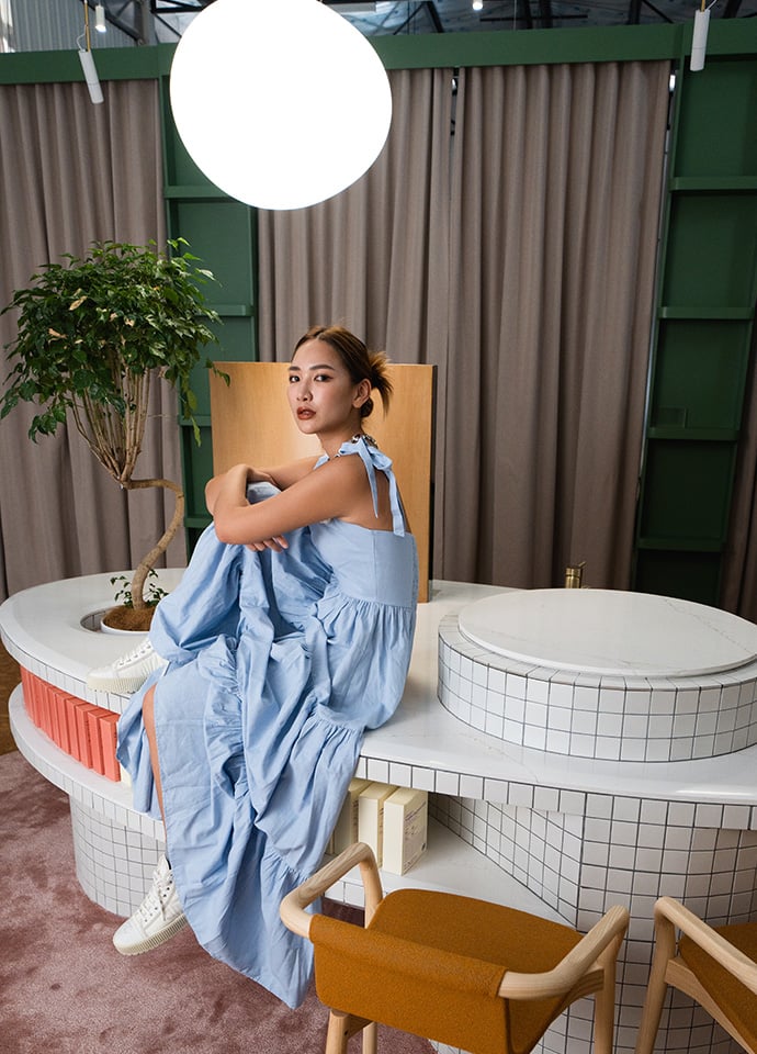
Jane Chuck inside the 'MotherQuarters,' that has transformed a former printing factory into the world of Chuck's and Motherchucker's. Photo c/o Jane Chuck.
Since it is their first space, there was no precedence and we had to build their spatial DNA from scratch. Their products and the persona of the team was a great starting point for us to develop and we coined the new HQ ‘MotherQuarters.’ It was exciting to see how a once unassuming warehouse like the former APW printing factory could be transformed into a cool, refined retail and commercial space.
How did the collaboration between you help to develop those ideas and create the feeling you wanted through materials, lighting and furniture?
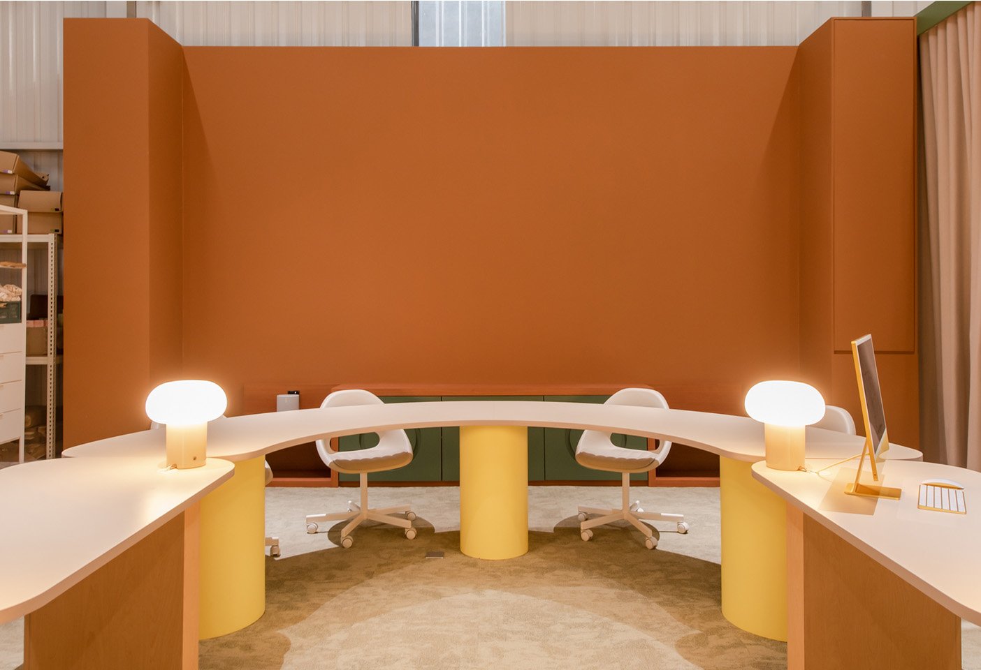
Jun Ong: Jane had a rough vision of what she wanted and we were also very inspired by the mood and aesthetics of their products. We wanted a nostalgic and domesticated space, to live work and play. It should not feel like a swanky, glossy showroom. The entire showroom revolved around an oval shaped counter in white mosaic with a fountain, while the office is centred around a U-shaped table to encourage breakout zones and horizontal working.
Jane Chuck: I always believe the elements bring out the soul of a space, and Jun is really good at picking the right pieces!
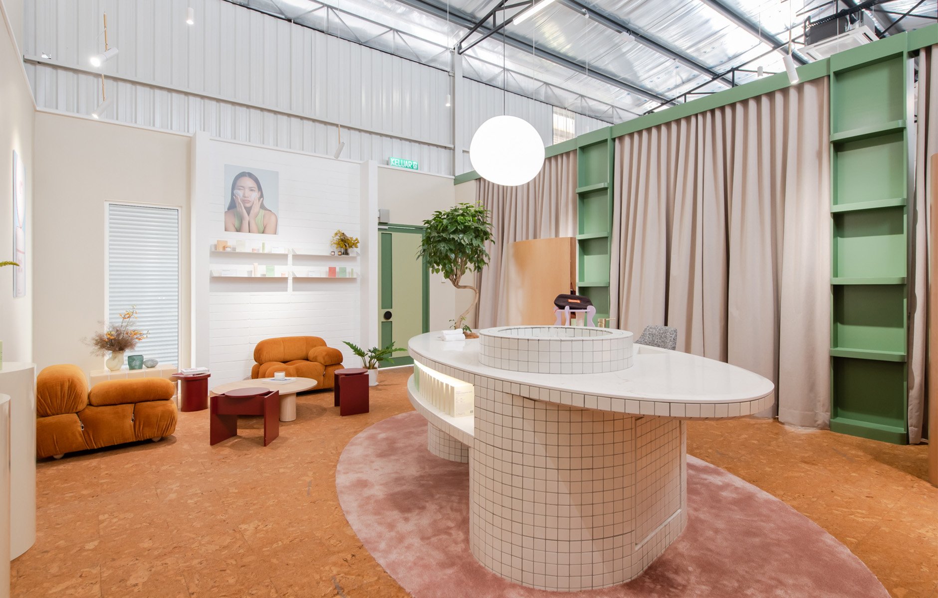
The Gregg pendant light by Foscarini illuminates the oval shaped counter in white mosaic that anchors the interior. Photo c/o Jane Chuck.
"I find Jun's work really inspiring and I wanted something that aligned with Chuck's and Motherchucker's brand image: something fun yet grounded at the same time."
Jane Chuck
Can you describe the choice of materials and some of the key details?
Jun Ong: We wanted to work with warm materials such as wood and carpet but also pairing them with contemporary materials, like stainless steel and stone. We used simple materials like white mosaic to clad the centrepiece that is an almost futuristic ellipse-shaped vanity island.
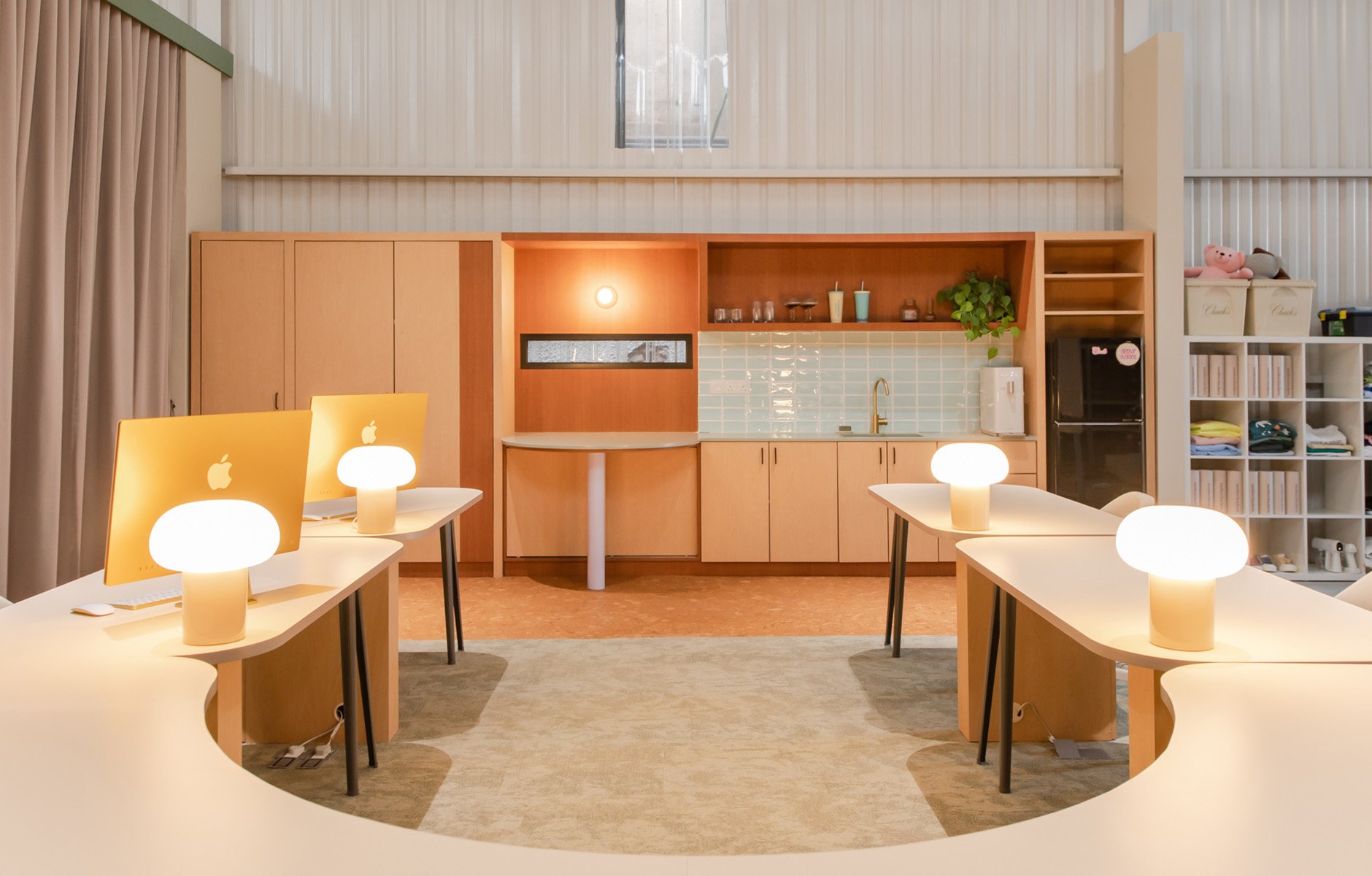
We also wanted to introduce some interesting materials that are not often seen in showrooms such as cork that is the main flooring material and a softer option to carpet. We then introduced natural light into the space and a lot of ambient/indirect lighting, with wall and table lamps that highlight the products and also the vibe of feeling at home. In terms of materials, Jane was involved in selecting the materials with us but she left it to us to decide how these materials are incorporated into the design and details.
Jane Chuck and the Thomas barstools by SP01. Photo c/o Jane Chuck.
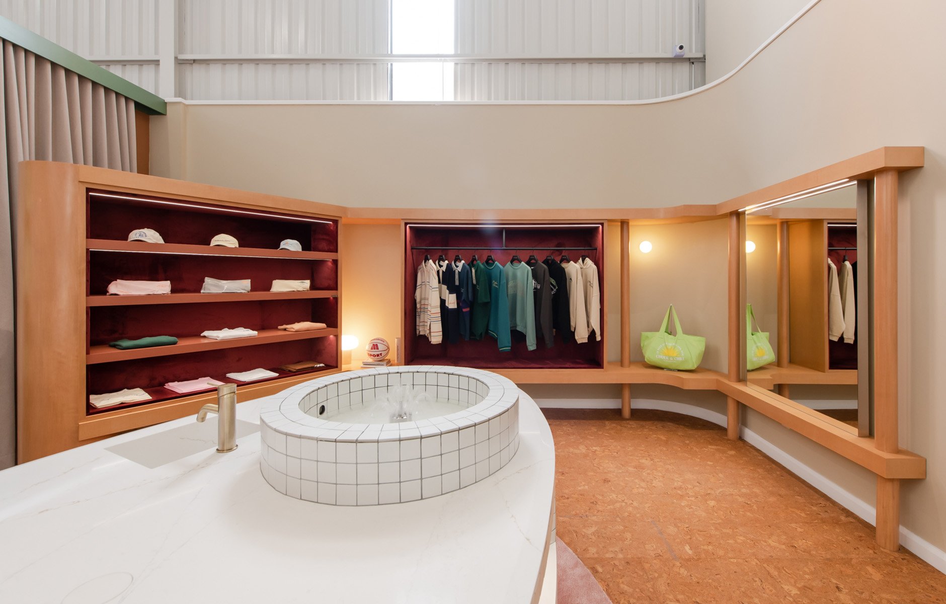
Curved joinery elements give form to the former factory and spaces for Motherchucker's pieces to be exhibited. Photo c/o Jane Chuck.
Warm colours and textures create the welcoming feel inside 'MotherQuarters.' Photo c/o Jane Chuck.
The layering of lighting, materials and textures has totally transformed the former industrial building. Photo c/o Jane Chuck.
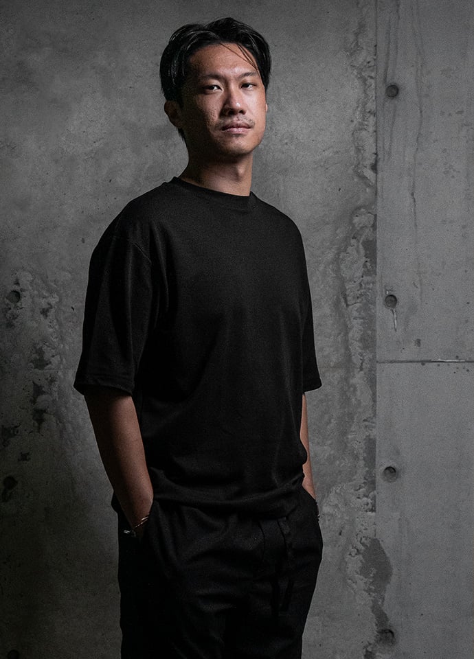
Architect and lighting artist Jun Ong of POW. Photo c/o Jun Ong.
With a focus on colours and materials that evoke nostalgia, the interior also balances contemporary pieces. Photo c/o Jane Chuck.
"Yes, the Camaleonda has always been my dream sofa and it fits perfectly with the space."
Jane Chuck
The business end of the interior where all the action happens. Photo c/o Jane Chuck.
The introduction of iconic pieces from the 70s mixed with contemporary designs is highlighted in the furniture selection.
Jun Ong: Jane and I were big fans of Mario Bellini and we knew the B&B Italia Camaleonda was perfect for the space. We picked a slightly textured yet warm fabric colour to really compliment the domesticated mood of the showroom. While looking for the chairs for the vanity counter, we wanted to go with a design that is more contemporary, formal and sleek, hence the SP01 Thomas barstool was the perfect fit, pairing alongside the organically shaped Foscarini Gregg pendant lamp above the island.
Jane Chuck: Yes, the Camaleonda has always been my dream sofa and it fits perfectly with the space.
What are you most happy with in the finished interior, and how have people reacted?
Jane Chuck: I am in love with the colours!
Jun Ong: I am most happy with the island as it is not only functional but also quirky and futuristic.
Jane Chuck: We are not open to the public yet but people who had visited love the space as much as we do.
Thanks for joining us here for More Space, it was great chatting with you both!