The latter part of the 20th century has seen standout colours that have come to define each decade. The 1950s with red, lemon yellow and powder blue, the 1960s embraced orange, red and (bizarrely) avocado, while the 1970s intensified the vibrancy and use of orange, and added, pink, purple and apple green instigated by globally revered designers like Verner Panton and Olivier Mourgue. So in 2022, where are design brands taking us?
Like many aspects of life, colour is now far more fractured and diverse. Annually, colour reference company Pantone announces the ‘colour of the year’ which fashion and interior magazines enthusiastically embrace but rarely do they take the world by storm. Today, designers and manufacturers are just as interested in clashing colours as they are in complementary ones, more than happy to own their individual colour path.
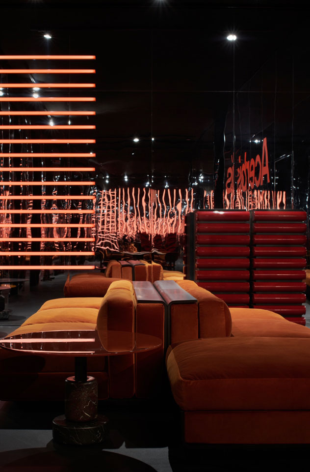
Take the classic Italian brand Acerbis (established 1870) whose 2022 palette is a complex hybrid of hues taken from very different points on the colour compass. Lacquered surfaces in teal blue, burnt orange, dirty yellow and pastel pink can be found in one collection, while forest green, brick red and navy blue are present in another.
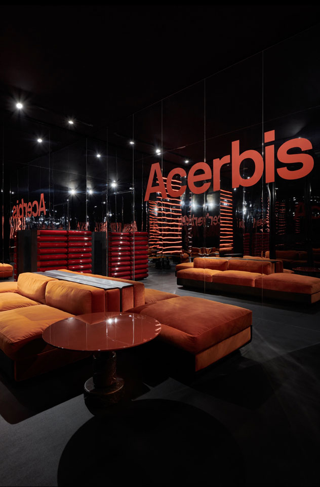
Acerbis x Salvioni Mirror reflections stand at the Milan Fair 2022 Photo c/o Lorenzo Cappellini Baio
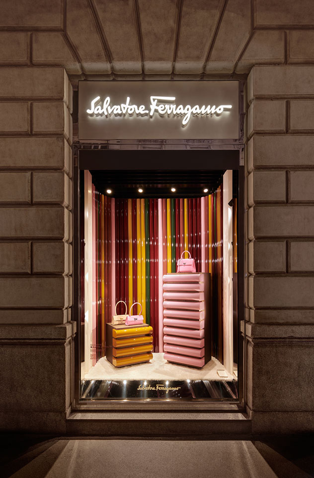
Acerbis x Salvatore Ferragamo installation at the Milan Fair 2022 Photo c/o Lorenzo Cappellini Baio
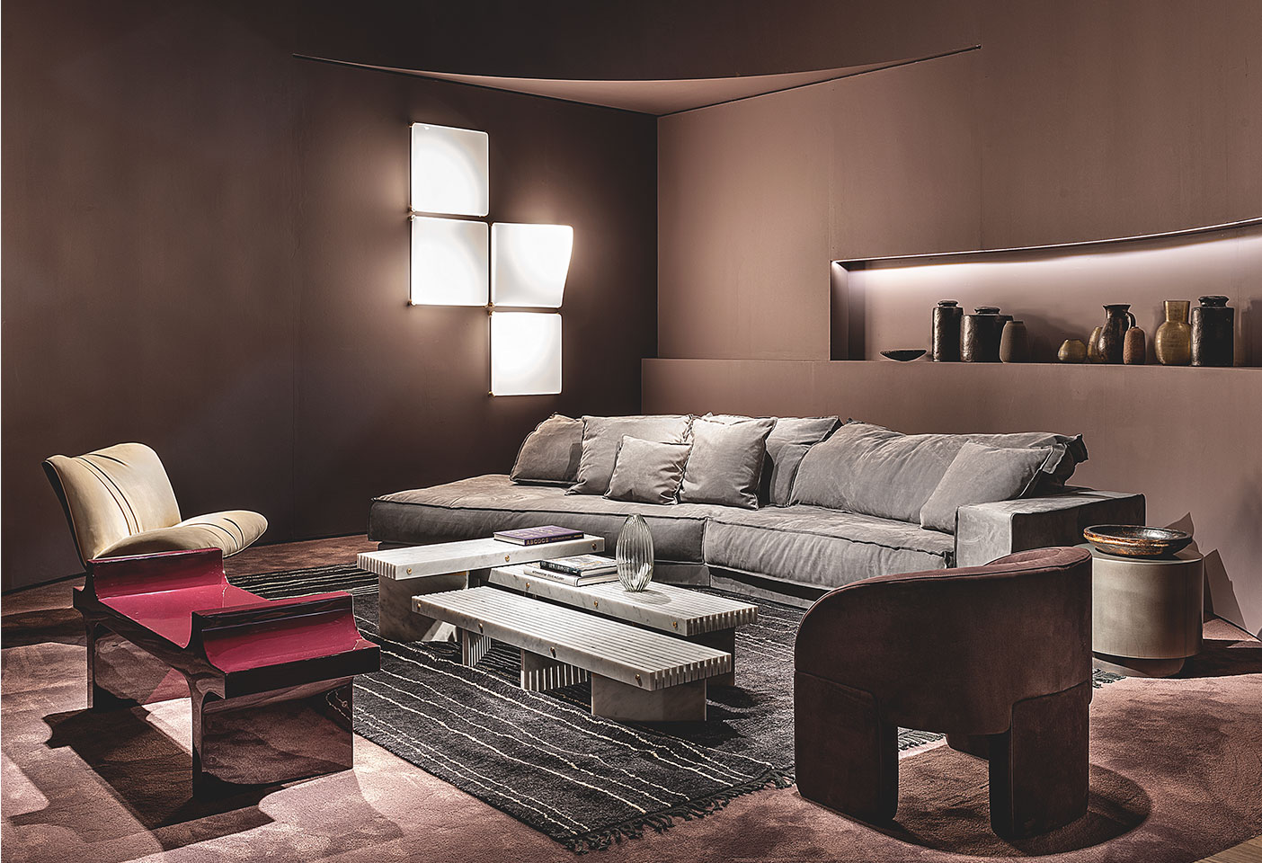
While fellow Italian brand, Baxter, breaks with traditional colour themes. Turquoise, plum, saffron yellow, pistachio and apricot all appear in their collection of exotic leathers and often highly tactile fabrics. Baxter refers to their approach as ‘modern eclecticism expressed through the balance of tradition and innovation… through the contamination of signs, colours, materials and topcoats’. In the hands of accomplished creatives, colour is not about following a trend but finding ways of expressing a mood that compliments the form and delivers the right attitude for each particular design.
Dutch brand Moooi has worn the moniker ‘design maverick’ since it was founded by Marcel Wanders and Casper Vissers in 2001. Moving away from their monochrome roots, the company now revels in the playful application of colour. Pinks, powder blue, egg yolk yellow, sage green and navy-blue feature as part of their chroma filled approach to furniture, fabrics and carpets.
Baxter stand at the Milan Fair 2022. Photo c/o Baxter
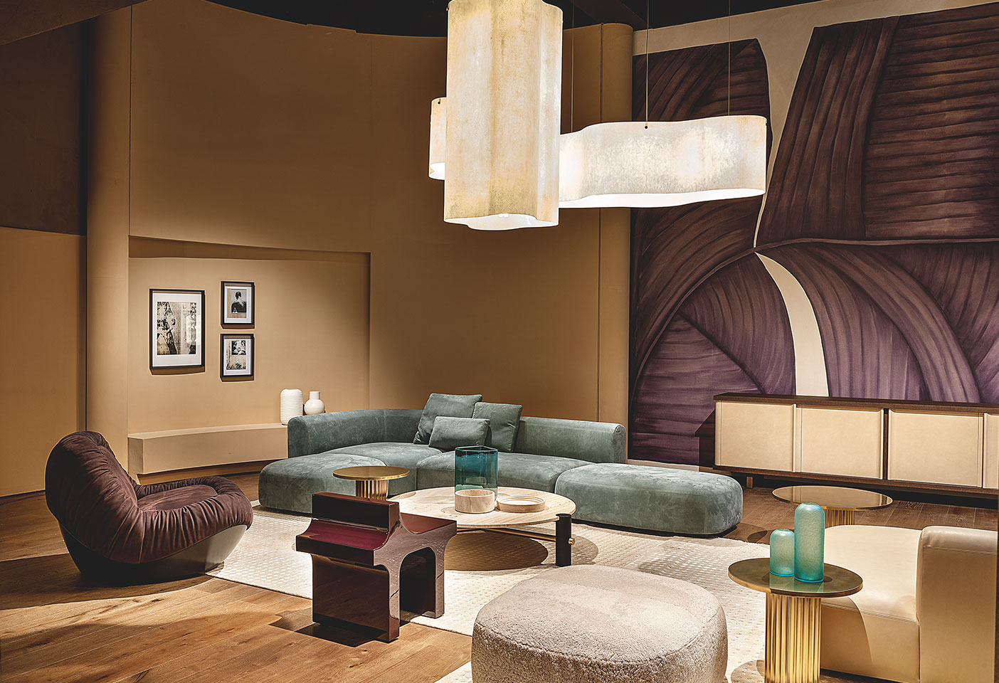
Baxter stand at the Milan Fair 2022. Photo c/o Baxter
Moooi Serpentine Rug is the results from playing and bending paper. Photo c/o Moooi
Much more controlled but still rather playful is Australian brand SPØ1 who this year released new ceramic and rug collections during Milan Design Week that involved unusual colour, shape and texture combinations. Petrol blue, terracotta, pastel pink and burgundy have traditionally been SPØ1 staples, but the brand’s 2022 collections introduced emerald green and golden yellow that add depth to a carefully curated body of work.
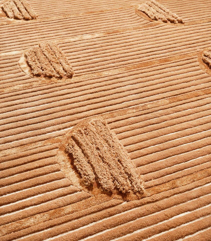
SPØ1 richly textured Kamu rug. Photo c/o SPØ1
The details of the SPØ1 Kitty rug. Photo c/o SPØ1
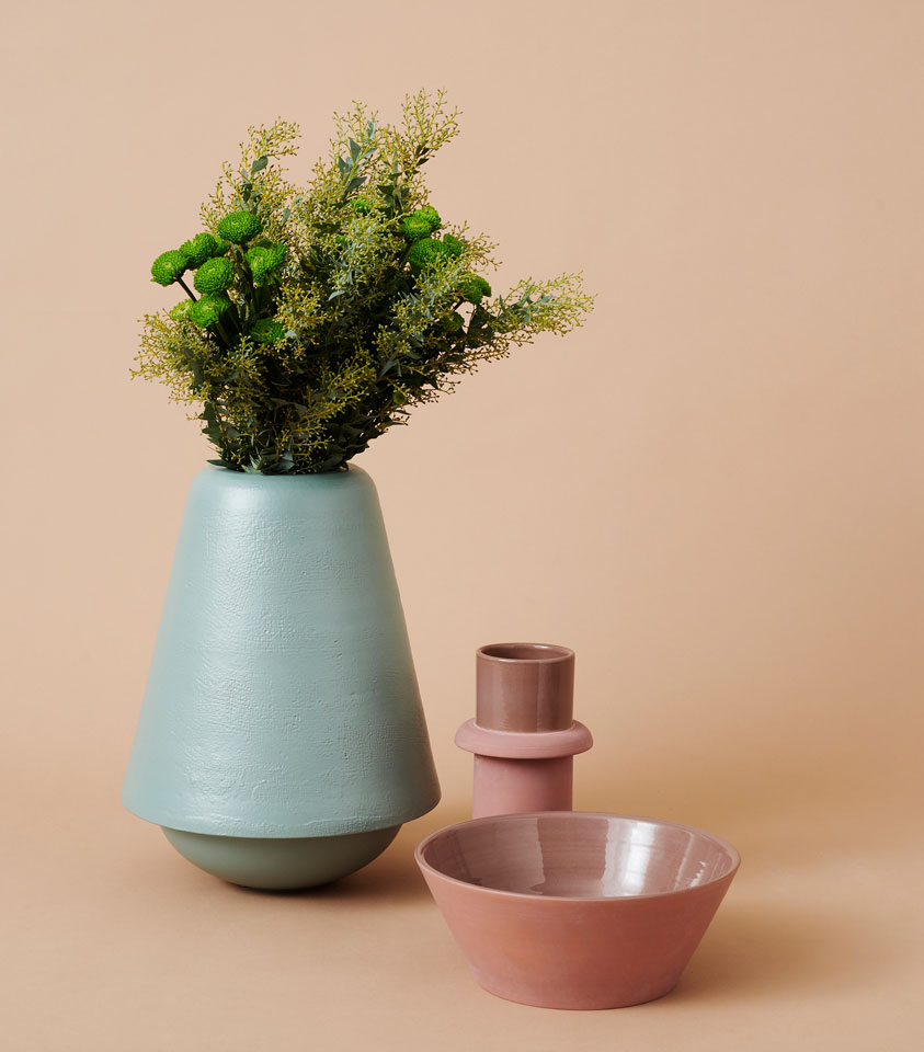
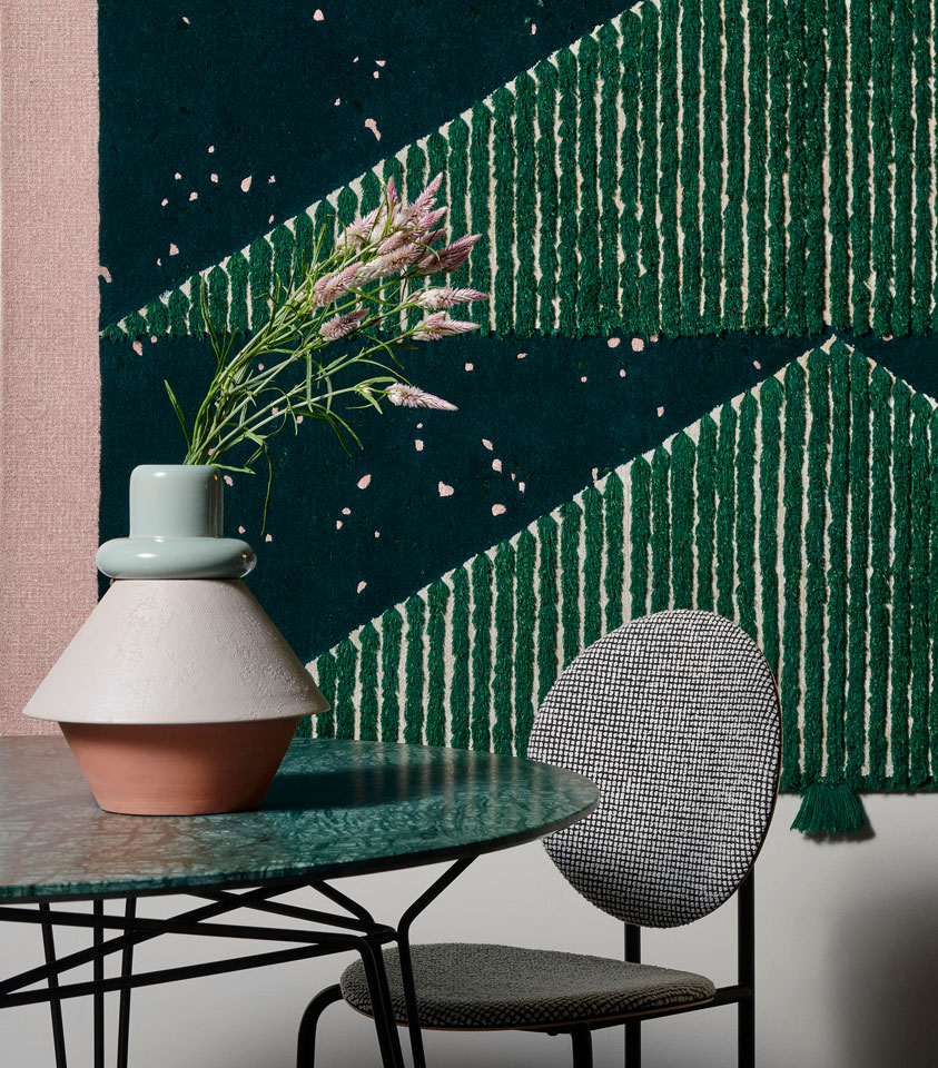
SPØ1 X Rometti Accessories collection. Photo c/o SPØ1
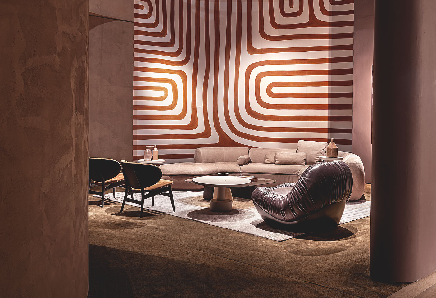
Baxter stand at the Milan Fair 2022. Photo c/o Baxter
Moooi Aldora Chaise Longue by Cristina Celestino. Photo c/o Moooi
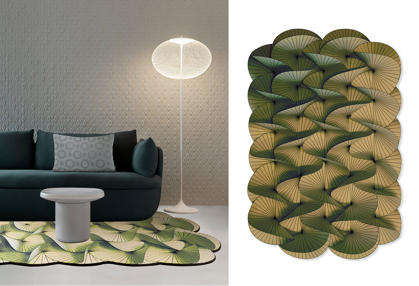
Moooi Serpentine Rug by Front. Photo c/o Moooi
Baxter stand at the Milan Fair 2022. Photo c/o Baxter
If 2022 could be summarised in terms of colour direction it would be ‘the more the merrier’. The secret seems to be about opting for a mix of unusual, complex colours rather than just one dominant tone, and above all the message is to apply colour with conviction.